

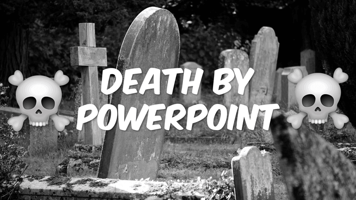
How to use Powerpoint? Is it an excellent tool or not? Is PowerPoint the worst piece of s**t that has ever hit presentation technology, or is it actually really good? The question is often asked, really frequently. Usually, there follows a hot debate about the advantages and disadvantages of PowerPoint, which in the end results in no one being more or less in agreement, and everything returns to normal. Someone might throw out the classic phrase “death by Powerpoint” and then walk away.
The problem with the question is that it is wrong. It is not in any way about PowerPoint, it is about the person using PowerPoint. I have personally seen absolutely disastrous presentations but also magically amazing presentations. Both were using PowerPoint. This is very important to bring into the debate, and the most important thing to keep in mind is how you work with:
- Structure
- Colors
- Fonts
- Images & Photos
- Animations
Simply put, the presenter must learn more about how to use PowerPoint. But it is not just how the presenter relates to PowerPoint as an aid, but it has at least as much to do with the design of the PowerPoint presentation. Something essential to remember is that Powerpoint is a tool, if you cannot use the tool properly, it will not be good.
How to Use PowerPoint Correctly
Answering the question “how to use Powerpoint correctly?” Is like answering the question “how to use a guitar?”. There are endless ways in which you can use a guitar. You can create music, you can use it as firewood, or to knock down a stick in the ground. However, I assume most people will use the guitar to make music. What is good or bad music is subjective, but certain parts are more objective, such as how we read notes. The same principle applies to how to use PowerPoint, what good or bad presentations are often subjective, but there are certain precautions that we will talk about more in this article.
The # 1 Biggest Mistake When Presenting
The first and biggest mistake you should avoid when presenting is to look into the projection screen your PowerPoint presentation is depicted in. You should, in principle, never look at the area where your presentation is projected. Your eyes are all too important and should focus on the audience. One tip for succeeding is to set up a laptop in front of you and split the screen by pressing the Function key (Fn) and then either F5 or F8 depending on the model. You now get a picture on the laptop and a picture on the projected area. You can quickly cast an eye on the notebook at the same time as you talk to and see the audience in the eyes.
“Hit Me With Those Laser Beams”
The laser pen is another fun phenomenon that presenters like to use, especially teachers and professors, for some reason. Stop joining it. If you do not have a robotic arm or an inhumanly steady hand, the laser dot will involuntarily jump back and forth on the screen. The lase does not lead to focus, as intended, but rather distraction on the part of the audience. Also, the red point that the laser pointer often emits is so small that the audience has to strain even to find it on the projector screen.
Show the Audience That You’re Alive
Move your ass! Do not stand still like a stick. Walk around, use your body language. Get into PowerPoint and the presentation. Are you currently showing a curve or a stack? Gesturing and showing how big or how small it is. Try to be more connected to your PowerPoint, and you will captivate your audience even more. For many, this is quite difficult, I am a classic introvert person, but I usually go into a role when I present. It will be easier for me, but we will save that for another article.
Just Get it Right!
There is a lot to think about here when it comes to building your PowerPoint presentations, but the most important thing is to consider the five points below. This, in combination with the basics of PowerPoint that we write about in this article, gives you the right conditions to build an excellent presentation, and also present it in a good way. The five fundamental aspects of an excellent presentation are:
- Structure
- Colors
- Font
- Pictures
- Animations
Structure
This is probably the most important aspect when building your PowerPoint presentation or any presentation for that matter. Okay, you’ve created your presentation. Maybe you came up with 30 pictures? Cut it to one third. Think minimalist – less is more. Your presentation is not in any way about PowerPoint but about you as a presenter, and the message you want to tell your audience. You only need the slides as support, and you rarely need 30 slides. Instead, use other tools such as whiteboard and scroll pad to create some variation in your presentation.
There are different opinions when it comes to how a PowerPoint presentation should be structured. A good rule that is easy to remember is “the rule of seven”. It means a maximum of seven words, a maximum of seven pictures, a maximum of seven digits whatever it is. So it is really taboo to write whole sentences and sometimes complete pieces that can sometimes be experienced. This is also when the presentation gets the stamp “death by PowerPoint”. Think minimalist!
Colors
Use uniform colors. Max 6 different variations. Imagine the colors blending into each other. If you look at the color picker in PowerPoint, try to select colors sideways so that you get the same hue on them.
Also, use the right colors for the right purpose. Green is positive and symbolizes growth. Red is negative and symbolizes warning or attention. Green, Brown, and light blue express everyday life and a moderate presentation. Too much white creates a dull, clinical impression, while too much black creates a mysterious and murky impression.
It is also important to remember that some people may have difficulty seeing colors or small objects. Therefore, be sure to use a font larger than 30 preferably, and not to use, for example, green letters on a red background, or vice versa.
Fonts
Be sure to use clear fonts. Arial is the default in PowerPoint and in my opinion, creates a pretty dull impression. Try to find a font that is simple, clear, and that you have not seen so often in presentations. The two best fonts (the clearest for the screen are), Calibri.
Which are the best and most effective fonts is a topic for a separate article. Different fonts also fit different well for different situations. Times New Roman (an ancient font, I know) is one of my favorites when writing reports in Microsoft Word. Should I write longer texts in other media, such as blogs or articles, I am very fond of the Helvetica family.
Images & Photos
Unity and message are the keywords here. All images in your presentation should be uniform. You should therefore not combine ordinary photographs with a little ClipArt and then maybe some design pictures you downloaded from the Internet. It’s all about creating as little confusion for the audience as possible – you do this through uniform images.
The keyword “message” is almost even more essential, and it should apply to ALL images you use in your presentation. The pictures should give support and power to what you say and the points you have inserted in the picture. No image should be meaningless decoration – it is pointless and confusing.
If you have given a motivational presentation to your sales team or workgroup, it may be a good idea to end with a picture that is just, motivating.
There are good sites to find pictures to include in your presentation, many cost money, but there are also excellent free options. I often use pexels.com, where the photos are usually entirely free to use.
Animations
Limit your animations. In my presentations, I only use the animation “Appear”. It may be boring, but I am not. The point is, therefore, that PowerPoint itself is not entertaining in any way. You should be. Leave the other animations to people who do not want the audience’s focus or attention. Why Animations are there at all is a mystery to me.
One mistake many beginners make when they start learning a new program is to be a little too impressed by all the effects and features. Animations in PowerPoint are such an effect that is often overused to make it feel “fun”. Sure, when making a presentation for your kids at Kindergarten, it may be useful to animate the presentation with animations to keep their interest. However, if you present it to an adult audience, they will quickly dismiss you as unprofessional.
Summary
All right, this was a quick overview of how to use PowerPoint correctly. As long as you have understood the basics, you will be able to create excellent presentations. What you should bring from this article is that you should put some extra focus on these five aspects:
- Structure
- Colors
- Font
- Images & Photos
- Animations
If you think a little logically and take into account which target group you are going to present to, it will go well! Remember that if you have any questions or comments on our articles, you are always welcome to contact us. If you need more detailed information or need help to build a presentation, you are also welcome to contact us.